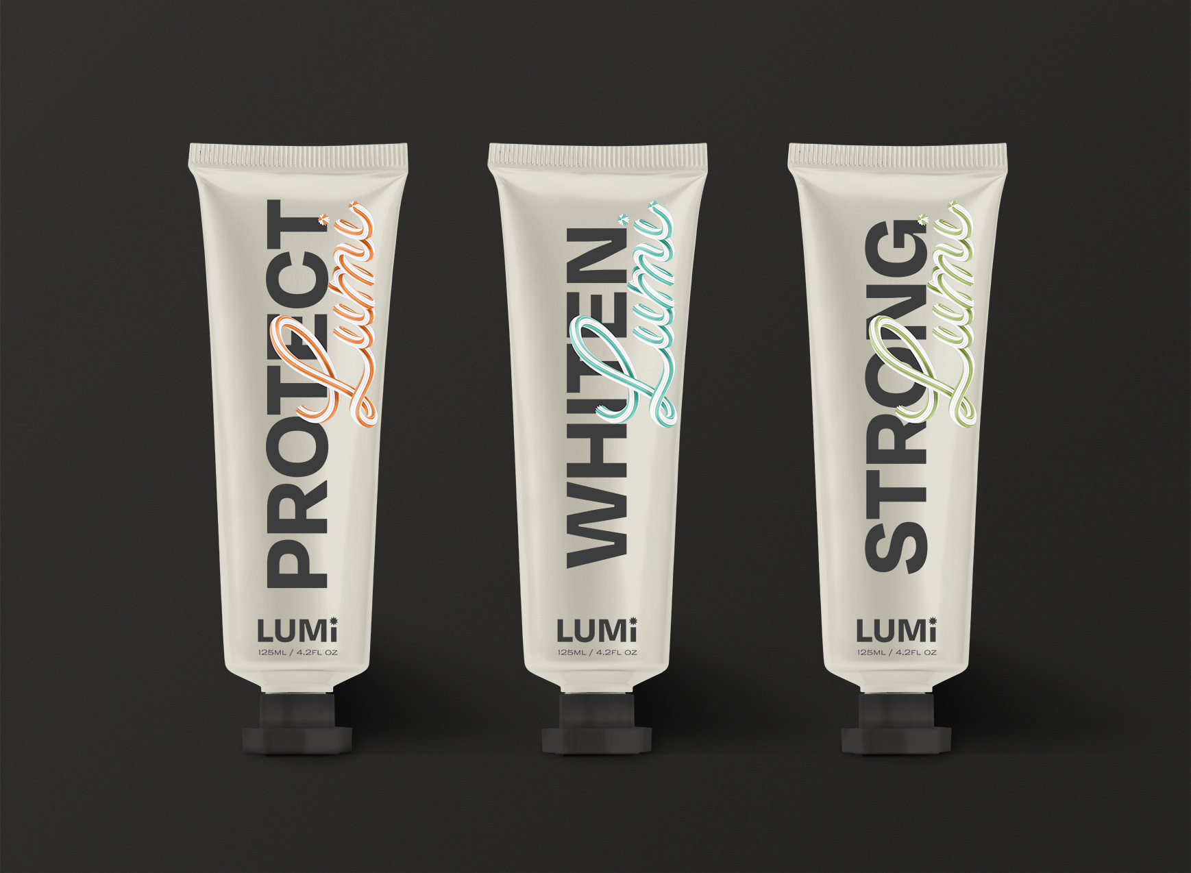
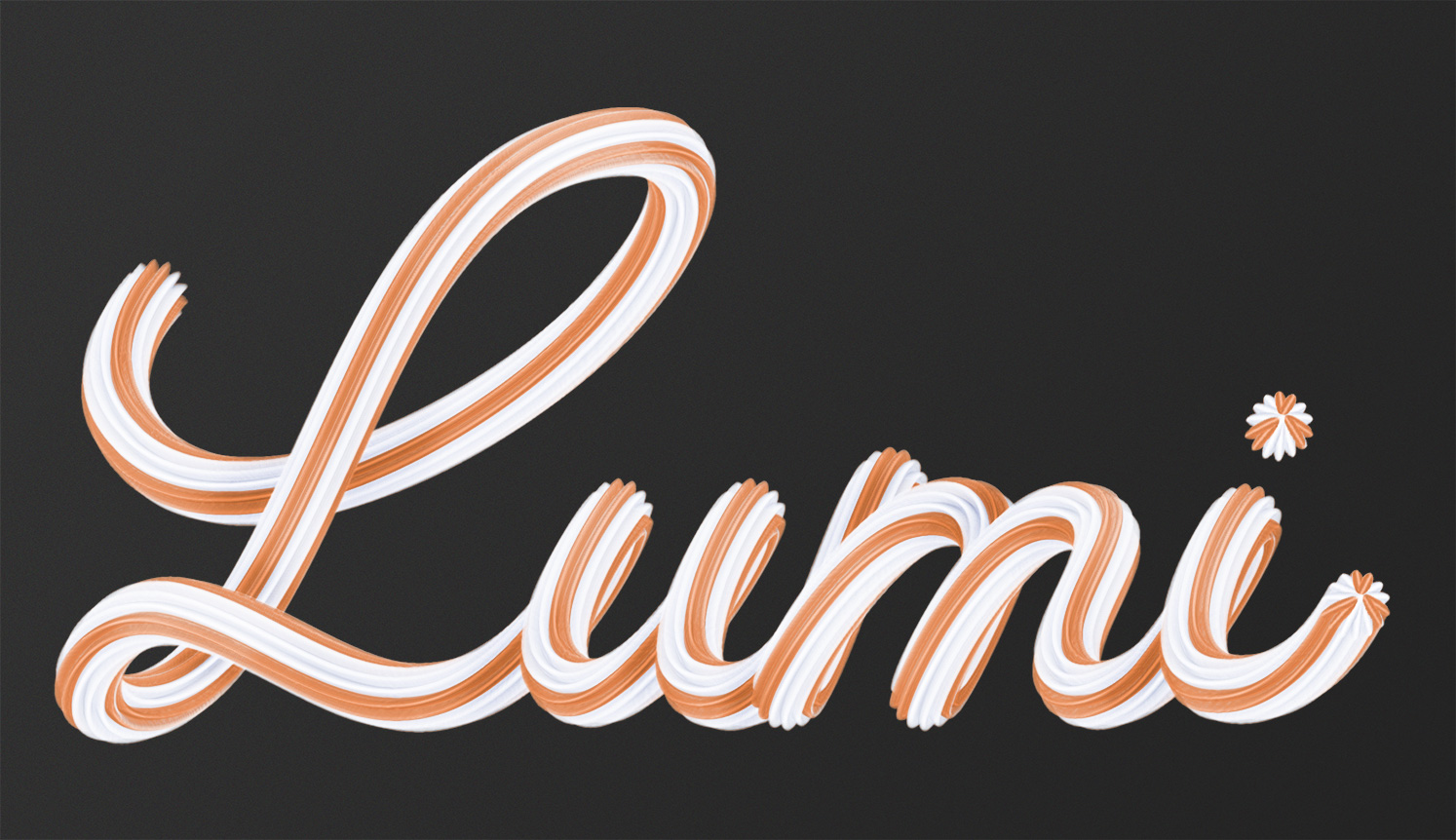
Lumi
Dental Care.
oral hygiene, but make it fashion.
| project type | skills used | key words |
| Packaging Design Course | Packaging Design / Branding | Lifestyle / Health / Beauty |
| back to school | one |
|---|---|
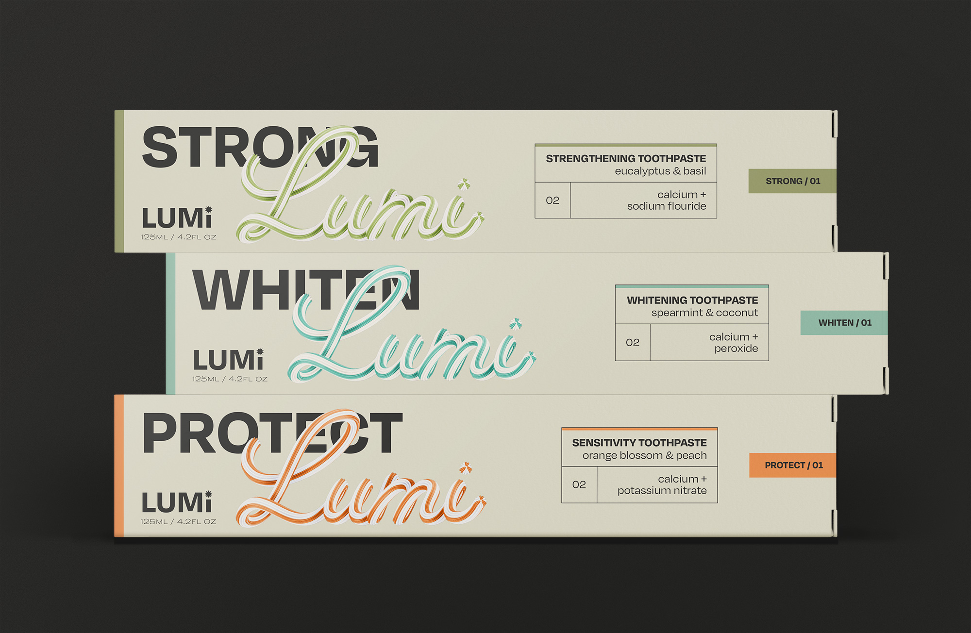
| Wanting to expand my design repertoire, I took a packaging design course led by independent designer Laura Evans. I learnt a lot, both about the technicalities of package creation and about the wider creative process. As part of the course, we were given a brief: create the brand and packaging design for Lumi, a new dental care challenger brand. | |
| back to school | two |
|---|---|
| Dental care has been stuck with the same aesthetic for many years now — the red, blue and white colour scheme, the swooshes, the dated 'science' feel. We were challenged to create a premium alternative which went up against the sameness of the supermarket shelf — something that repositioned a boring commodity item into something desirable. | |
Stay fresh!
| talking to the right people |
one |
|---|---|
| The target audience is Upper Gen-Z — young adults who are able to make their own decisions about what and where to buy for the first time. With that in mind, I looked to brands across health and beauty which have been really successful in engaging young people. | |
| talking to the right people |
two |
|---|---|
| I was particularly interested in the world of skincare. Led by brands like The Ordinary and Drunk Elephant, we've seen a monumental transformation in how people engage with skincare brands — suddenly, consumers are encouraged to know and care about ingredients lists and have an understanding of what different acids, retinols and serums actually do. The world of dental care has yet to embrace this in a meaningful way, instead being crowded with marketing-speak which doesn't actually appeal to the audience. | |
| forming habits | one |
|---|---|
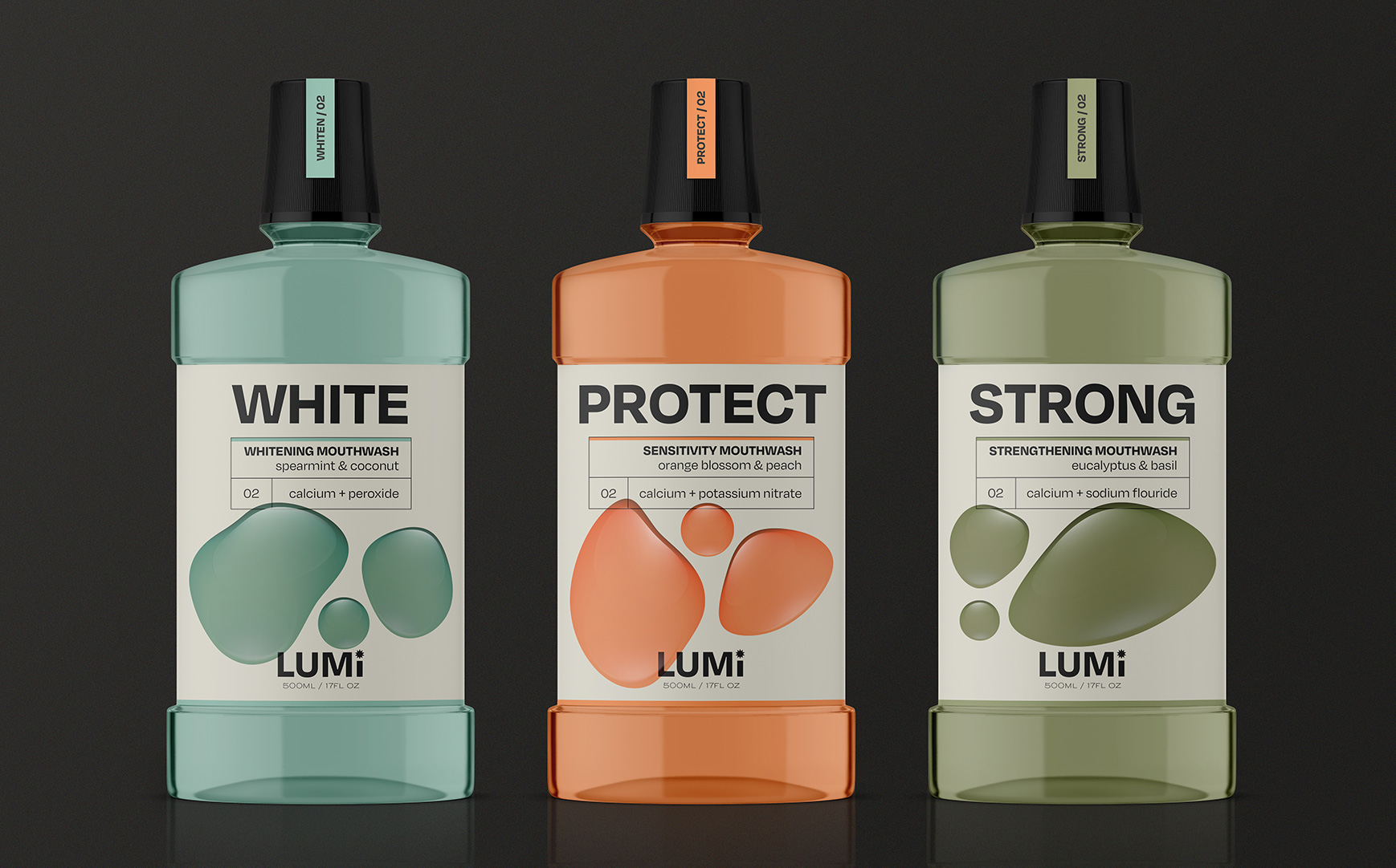
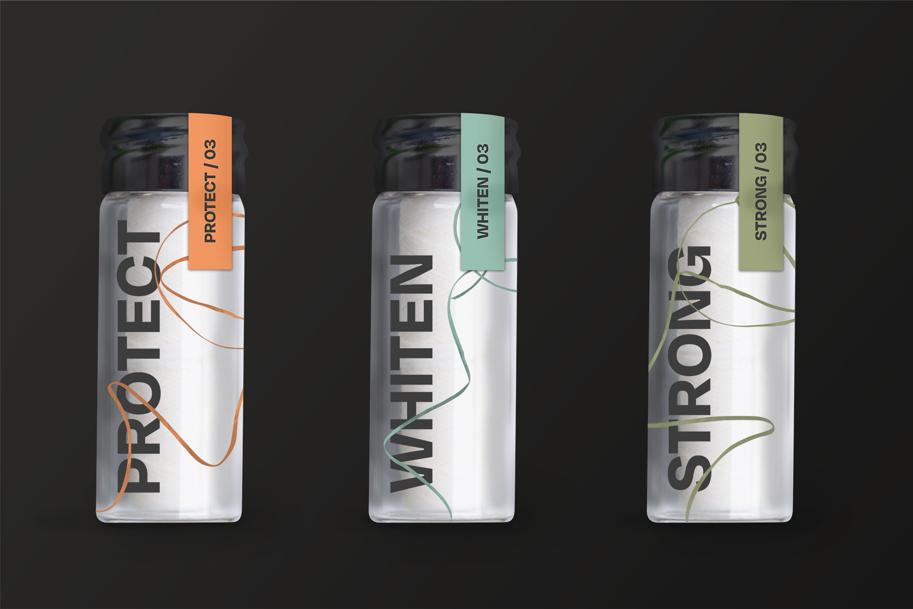
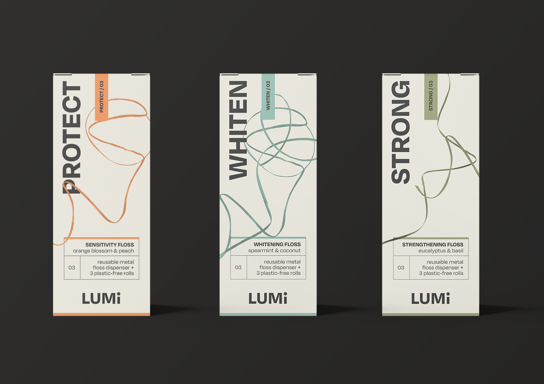
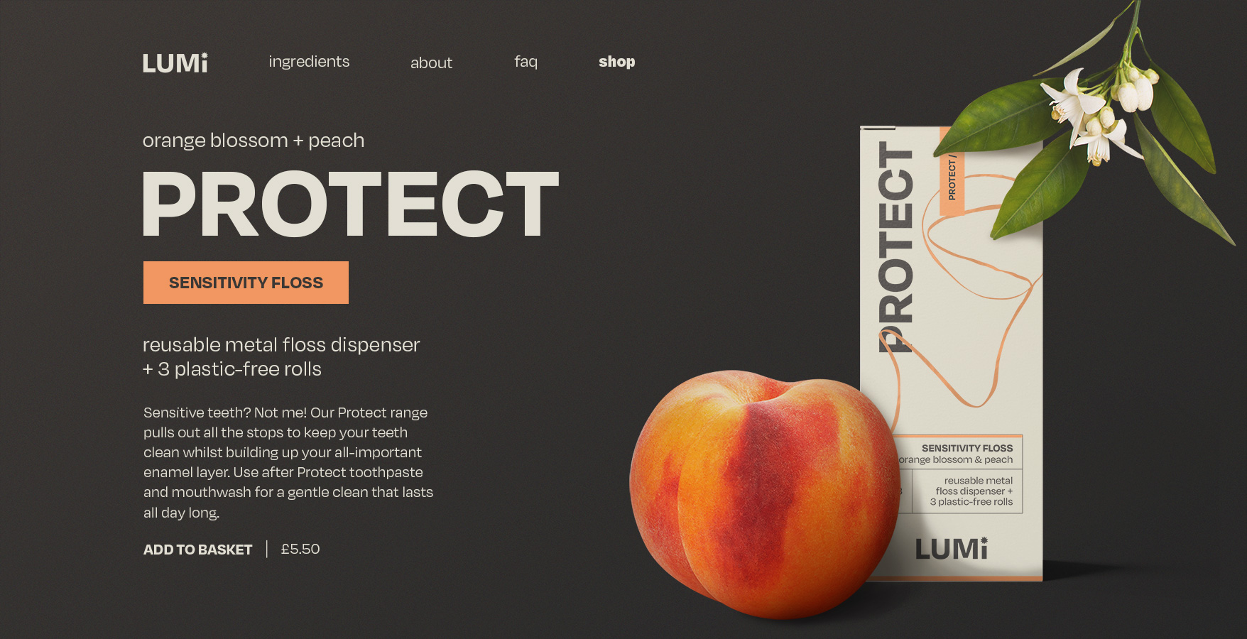
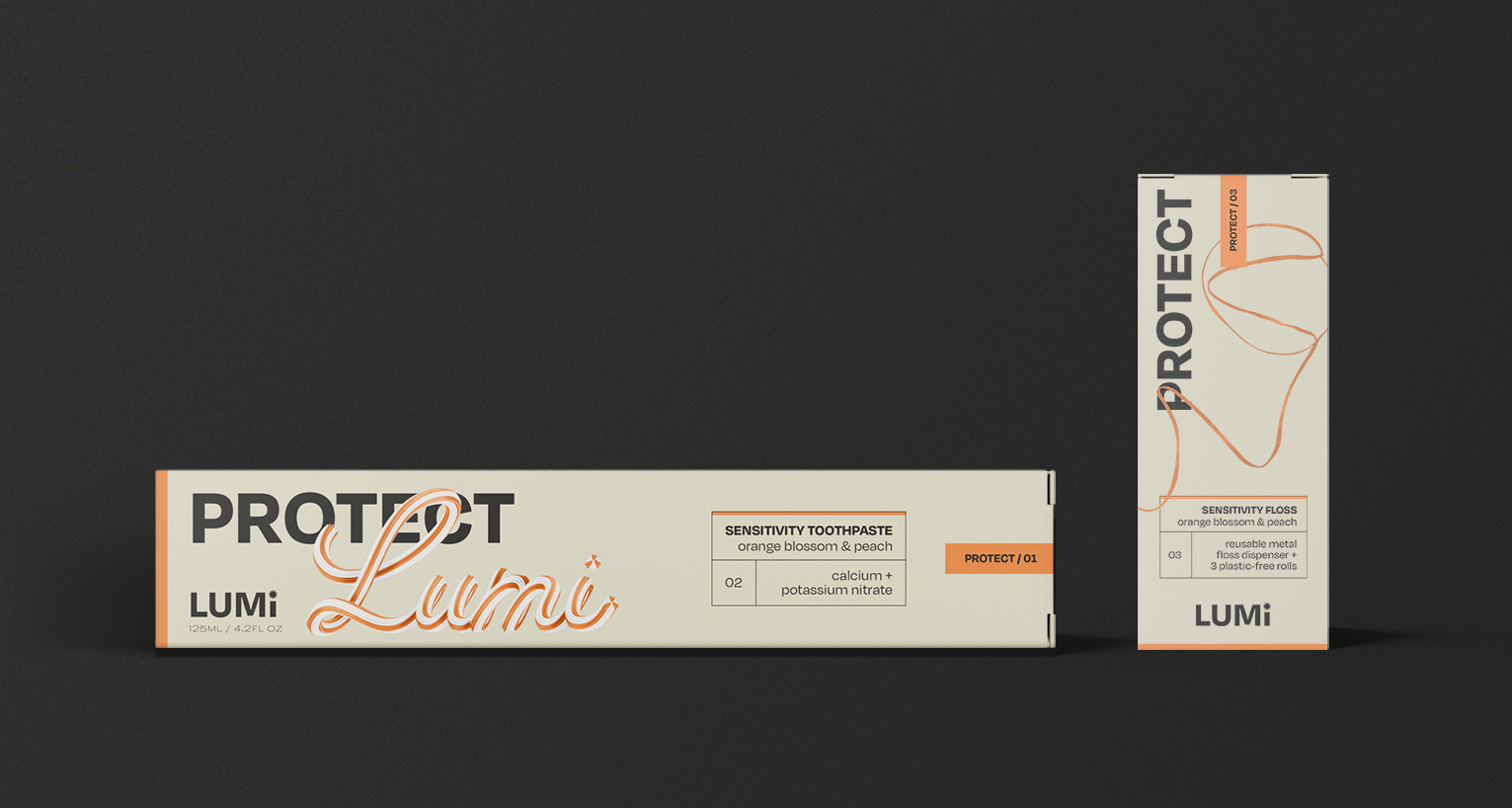
| In line with this idea of audience education comes the idea of routine. Ever more complex skincare regimes and habits create a sense of control for the consumer and loyalty to the brand. We can do the same with dental care. The Lumi product line is split into three ranges: Whiten, Protect and Strong, each with unusual and distinctive flavours. Broken down into numbered products, the audience can create a routine which becomes an important part of their day, morning and evening. | |
